A General motor is the most prominent American vehicle company, and was established on September 16, 1908. It is a manufacturing corporation brand which is focusing on electric vehicle technology.
General Motors has 37 production plants in several countries. Chevrolet, GMC, Buick, and Cadillac are its famous four main automobile productions. All these companies produce cars, buses, and trucks.
GM has 70 suppliers, and a number are vital producing vehicles. This company has a 50% market share in the United States. It was the largest automobile manufacturing company in the world from 1931 to 2007.
Meaning And History Of GM Logo
General Motors Logo’s meaning is “mark of excellence,” broadly regarded as one of history’s most popular and instantly familiar car logos. It has a clean and straightforward graphic identity.
GM logo is one of the most straightforward logos known till now. It is the most impressive and instantly car symbol in history.
The GM logo had only two main reshapes during the company’s history. This company is known for its high sales with memorable logos. General motors have many gains and losses in their manufacturing periods. Here we discover some of the main events that occurred in the history of GM.
1908 – 1938
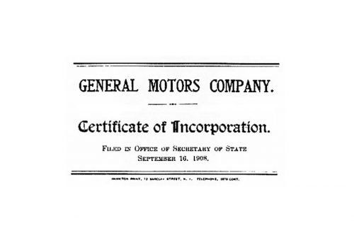
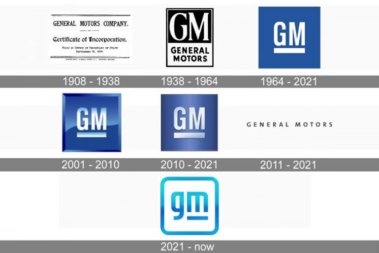
The company created the first logo of General Motors in 1908, made in white and black colors. This logo has black letters on a white background with the number plate on the top executed in all capital letters.
This logo was in a rectangular form which has borders at the bottom and top. The text of “General Motors Company” was shown at the top of the logo. “Certificate of Incorporation” was an inscription below the logo.
This logo wrote on September 16, 1908, in the Field in the secretary of state’s office
1938 – 1964
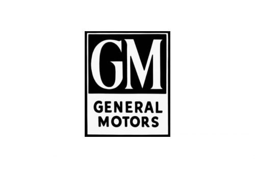
The General Motors company designed its first real logo in 1938. This logo has vertically located with a dull four-sided palette which had divided into two main parts. The upper part of the logo was more significant with a black background. It contained the “GM” letters on its more substantial amount and had a “General Motors” caption on its lower part.
The wordmark of “GM” had affected in a classic serif font. It had shown with confident and stylish lines with pointed corners. The capital letters of “General Motors” used a modern and plane sans-serif style, matching the traditional style of the nameplate.
That logo was a short and straightforward visual identity, which showed a powerful company. It was also suggesting a sense of stability and authority.
1964 – 2021

In 1964, the company decided to redesign the GM logo, which became minimalist and straightforward. There were the letters “GM” with an underscore on the blue square.
The symbol of General Motors has a blue square with rounded angles. GM logo also has a white underlined wordmark on it.
2001 – 2010
In 2010, the company simplified the General Motors logo. It gained a dull metallic blue color, and a wordmark is showing now with black paint. This wordmark makes the letters more attractive and dynamic.
General Motors logo has shown in three dimensions. The letters “GM” were decorated with shadow and light with a silver border that seemed around the logo. The white and silver color combination reflects the brand’s skill and trustworthiness, giving it more confidence.
2010 – 2021

The General Motors companies used a simple wordmark, and the border became noticeably smaller in 2010. The logo has shown lighter and darker blue color with a thicker underline wordmark.
2011 – 2021

The new Logo of General Motors 2021
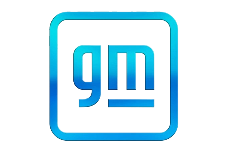
General Motors launches a new marketing strategy. The new logo features the automaker’s “gm” original in lowercase letters with the “m” underlined. The new corporate logo will use in all groups of transport networks going forward.
General Motors’ new logo aims to combine heritage. It is also bringing a fresh and lively look to GM’s familiar blue square. GM’s in-house design team has designed this new logo.
The new logo will be applied company-wide straight on January 11 with digital media.
The well-known General Motors logo becomes a lowercase restoration, replacing its look for the first time in years.
- General Motors has changed its logo as GM moves toward electrification. The company kicked off an ad battle promoting its assurance to EVs.
- The new logo disappears from light blue to dark blue and shows the GM letters in lowercase type.
- General Motors declared in November that it’s speeding up its decision towards electrification and now is pointing to having 30 electric automobiles on the market by 2025.
Final Words
It is a coincidence that General Motors is in blue and white color. General Motors logo contains the company name in a modest blue and white color scheme with an underline. This emblem is a subtle and organized image for the company.
The logo of the GM Company reflects the company’s moves into the world of vehicles. The letter “M” represents GM’s moving forward into the future.

