Audi is one of the leading and best automotive brands at this time and has been for decades. It is one of the finest designers of high-quality automobiles. It is considered one of the largest globally, and the brand has reached its peak today. It is an excellent and attractive exterior design combined with efficient and high-quality interior and engineering work.
Audi has been a powerful company since its inception in 1910. The company first worked for a company called Auto Union. The brand first launched in 1910 with the Audi name, and then Audi began producing its cars.
Since then, the company has become one the largest companies in the world. It has its unique ups and downs, just like every company has, but it has always been there.
In general, the most attractive company logos are those logos that tend to capture some meaning behind them. That has some more profound meaning and story behind them. The Audi logo is exactly that, and that’s why it’s so successful in capturing the essence of Audi.
Short History
As you know, Audi is a German carmaker familiar with its luxury cars. August Horch founded the company in 1909. But this was not Horch’s first car company. He already had a company bearing his name, but he left after a dispute with the board. Then Horch and Cie Motorwagen Werke start Audi Company.
August Horch sought new ideas as he could no longer use his name for new business. The founder finally chose the Latin translation of his surname. It means listening in German. That’s how the Audi name was established.
The Merger Of Four German Companies
When the Great Depression hit the German automobile manufacturing industry seriously. Then four different companies, including Horch and Audi, joined forces to form a consortium called Auto Union AG.
The basis for creating the logos we know today was the combination of four companies and their symbols in 1932. Take a look at these companies.
-
AUDI
The Audi logo consisted of a company name using a black inverted triangle working font before the consortium. At the top was a semi-circular number 1 that looked like a gear lever. August Horch probably wanted to tell his old company that he was still involved.
-
DKW
It was a company specializing in the construction of motorcycles and automobiles. Their logo was the outline of a shield with company initials surrounded by green triangular serif-free fonts.
-
Horch
August Horch’s first company had a different logo. The company name of a multidimensional H in black and white and a very stylized and irregular serif-free font above it. It gave the logo an almost playful look. In addition, the text was placed on several arched lines, adding a gorgeous look to the entire logo.
-
Wanderer
If you look at the Wonder Women logo quickly, you might think it’s a symbol of Wonder Woman. The two logos consists of several stacked Ws that create a counter form. However, the car manufacturer’s logo is distinguished by its winged ends.
So it was hard to find a way to keep these four very different logos within the new brand image. Therefore, companies relied on new unity as inspiration, except for Auto Union’s name in the center. It was at this time that four rings appeared and became the logo we know today.
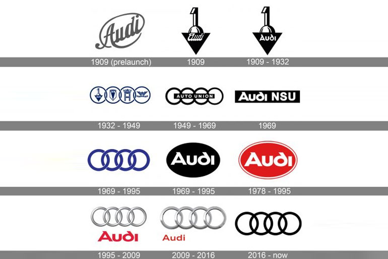
Evolution Of The Audi Logo
Today, Audi is an independent division of Volkswagen AG. Manufacturing plants are located on all continents. The plant produces crossover, convertible, midsize, executive, and business class vehicles. The Audi logo changes frequently. You will know how it was now.
1909 (Pre-Launch)
The first Audi logo appeared in 1909. The pre-launch logo was directly related to the name of the company created by August Horch. Translated from German, the name of the founder of the company means “listen.” August Horch’s business partners have proposed the original version, a Latin translation of the family name.
In the imperative mood, Audi means listening. The name was reflected in the first version of the logo. These are beautiful diagonal letters, and the emblem is made of dark gray. There is nothing extra.
1909-1932
During this period of corporate activity, the logo remained virtually unchanged. The only difference from previous versions is that the company name is written in a different font. The other elements remain the same. The first place is the German car on the podium. They combine impeccable quality with a higher level of comfort.
1932-1949
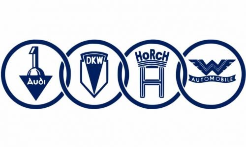
In 1929 the world economic crisis began. Due to the general lack of money, Audi cars were practically not bought. In 1932 a significant event occurred. Horch, Wanderer, DKW and Audi have merged into one. Therefore, concern about Auto Union AG automobiles has arisen.
The old logo is no longer relevant. Introducing a new version of four rings with related brand emblems. This logo symbolizes the unity of the four companies and the tremendous strength of the union.
1949-1969
At the beginning of this period of activity for German companies, the logo changed significantly. The partner emblem has been removed from the ring. Instead, a black rectangle across all the middle circles appeared on the logo.
An inscription was made inside the rectangle. It is the company name: Auto Union, published in white on a black background. Therefore, the co-founders of the company wanted to show the power of their union.
1969-1995
In 1965, the company came under the control of Volkswagen. Since then, the factory has produced cars under the old Audi brand. I had to change the old logo. The new decision symbolizes self-confidence and strength. It was presented in the form of four rings linked together. However, there were also significant changes, the ring’s blue color and the company name’s lack.
During this period, another unique logo was developed. It is a horizontally long black oval. With such a geometric shape, the Audi lettering was created. The inscription is designed in a rather unusual way. Attention is drawn to those moments: non-standard fonts, bold white letters, and rounded letters d.
1978-1995
In 1978, an eye-catching logo was developed that cannot be overlooked in the car. Black has changed to red. The old white letters remain. A notable element of the logo is the pale white and red contours. I saw the new logo of the car company from a distance. White and red are traditional combinations related to courage, activity, and energy.
1995-2009
In 1995, the designer developed a rare version of the logo that was well thought out in every detail. They combined the previous two solutions and simplified them. Instead of the blue ring, a three-dimensional silver ring has appeared. Below them is Audi’s lettering. It is a bright red letter that attracts attention.
The designer tested and balanced the giant inscription and the delicate silver ring. The original logo was favored by the company’s co-founders and existed until 2009. It harmonizes exclusivity and elegance.
2009-2016
In 2009, the designer decided to change the logo a bit. The company name has been moved from the center to the bottom left. Enrollment has decreased. The silver ring has changed. Its size has also increased. The silver ring has become the main protagonist. These elements symbolize the unshakable unity of the four well-known founders of the automotive industry.
In 2016, the designer significantly simplified the Audi logo. The 3D element is gone. The color of the connected legendary ring has changed. It is now black instead of silver. There are no additional registrations. The original logo of the car manufacturer looks elegant and concise.
Symbol
The four rings on the Audi emblem represent the 1932 Auto-Union-Coalition-DKW, Horch, Audi, and Wanderer. The first version of this logo showed that each ring has the symbol of four merged companies. It is trusted that the use of the four-ring logo will recreate the idea of Olympia and the Olympiad.
Shape
The four rings on the logo are three-dimensional today and look more sharply cut. It is styled with a chromium look, giving it a premium feel. It represents the 1932 merger and represents security. At the same time, it displays the qualities of power and succeeds in capturing the size of the entire company.
Color
The dark colors used in the Audi logo have been added to a more transparent, more lustrous look. The aluminum color of the ring reflects Audi’s bottom competencies that make the brand stand out. The color of the logo reflects its innovative power and subtle design.
It is smooth, bright, and has a sophisticated touch. Fonts represent the look of a more refined, efficient, and innovative design. Overall, Audi’s color spectrum supports the latest design technology.
Font
The font used is more standardized, sans serifs, and looks simple yet modern. To commemorate the 100th anniversary, we updated the logo. It is started in September 2009, with minor changes in font size, color, and overall appearance. To represent future innovation and power.
Conclusion
We must be bold to ensure the success of our business. Audi is a company that has successfully overcome its challenges, and its four rings are now recognized around the world. You might think that the current logo is much better than the original logo. The logo’s shape has no beginning or end, so it is used precisely to represent unity and infinity.


