


People who love cars are familiar with Chevrolet cars; because it is one of the famous car brands with an American basis. It was established in 1911 by William Durant and Louis Chevrolet. This is the leading brand of GMC which is the top-selling car marque company in the USA. Today, we are discussing its LOGO meaning and history.
Meaning And History
Chevrolet has an iconic logo that has a rich history behind it to be told to interested people. It is also known as Chevy in the world. Its logo is very popular and won the award for classic brand identity design logo. It is highly recognized among different people all over the world. Its logo has a nickname which might have listened before “Bowtie”.
The logo was designed by the one of founders of the car brand, William Durant back in 1913. The story of the logo’s creation has three different versions which we will tell you gradually. Firstly, Durant said that once he was staying in a Parisian hotel where he became inspired by a certain wallpaper pattern. Secondly, it is said that Durant’s daughter drew the logo during a family dinner.
Thirdly, according to reports it is said that Durant helped his-self by modifying the existing logo of America’s famous coal company “Coalettes” whose advertising was seen by him in a newspaper. He slanted the “Coalettes” logo with a bold graphic look.
1911 – 1914
The first-ever logo of the brand was the hand-written signature of Louis Chevrolet who is one of the founders of the company. It was executed in a distinct and bold with a handwritten typeface.
1914 – 1934
In these years, the famous bowtie logo was launched. In the starting, the color scheme was light blue and gold with gold lettering emblem’s version. This thing made the looks of the logo more luxurious and elegant. The wordmark was placed horizontally.
1934 – 1940
Now the color scheme was decided to change along with the typeface too. From emblem to monochrome and size of letters were increased. The black and white color combo made the logo looks more masculine.
1940 – 1945
After that, the company decided to remove all the backgrounds and keep only letters. In the letters, the V letter was made larger in an elegant Serif typeface. Now the logo started looking like a high-class styled victory sign. It wasn’t even framed and considered the simplest one in its history.
1940 – 1950
In these years, the company again decided to keep the old color scheme in operation; the blue and gold one. But the typeface again changed and letters were kept bright and intense. The design team also added the golden frame around.
1950 – 1964
Intense changes were made in these years. The logo’s color scheme is completely changed from light colors to bold ones. The red and white combo with red background kept the italicized word mark.
1964 – 1976
In such years, the company decided to keep the logo more minimalist than ever that’s why removed the color schemes. They simply made a bowtie and a word mark inside with thin lines contour.
1976 – 1988
This year, the Chevy logo was painted rather than using a simple typeface. Again the color scheme was kept blue with thin white framing and created a black shadow of the bowtie frame. The wordmark was placed in the middle of the horizontal line.
1988 – 2002
Now the word mark was removed from the logo and proceeded out with a single emblem typeface. The color scheme was again red with a black background and blue cross.
2001 – 2002
The cross of the logo was made in three-dimensional spaces with a dark red color scheme. This time, the Chevy logo looked confident.
2002 – 2010
In these years, the logo was changed twice. Firstly the custom typeface was recognized extendedly among people as it has smooth thick lines around which looked chic. Nextly, the company decided to precede the bowtie of the logo in the golden background for Chevy’s visual identity. This logo looked very powerful.
2010 – 2013
In 2010, the logo was kept the same as before but the addition of texture was added. Moreover, the patterns got up with small dots enclosed into the silvery frame. The typeface was black and narrow.
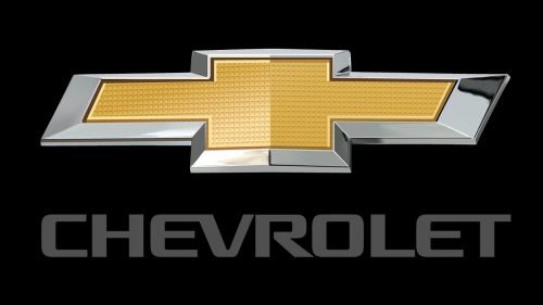
2013 – Today
On the company’s 100th anniversary in 2011, the company re-launched the logo by making it more luxurious and beautiful. They had thickened the frame of the bowtie which looked more dynamic.
The Emblem
The logo’s bowtie emblem has a wide type of design with a stylized cross. The cross-figure is made by a horizontal parallelogram overlapped by a square. Since its introduction, the bowtie has gone far away with different color variations but the essential shape has always been maintained. The bowtie is considered one of the longest-standing logos in the history of American branded Cars.