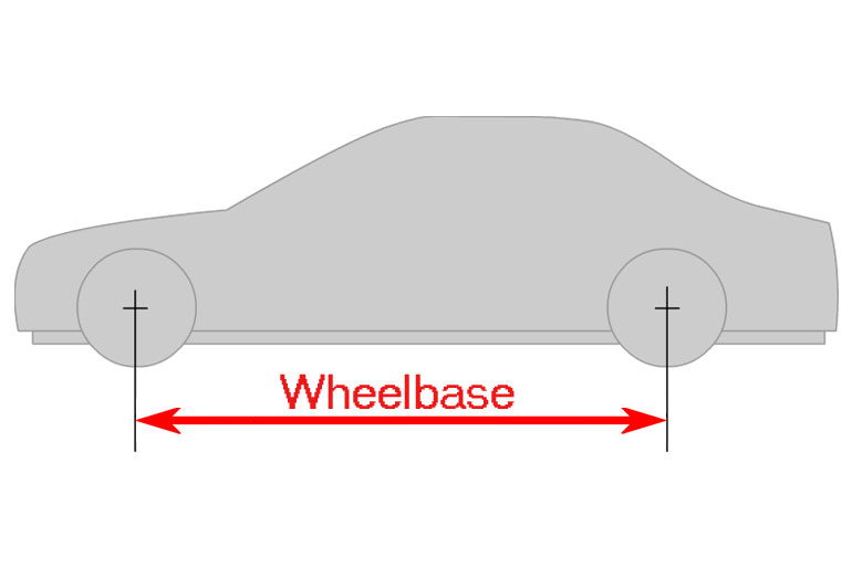


Buick is considered to be one of the famous car manufacturer brands which came into being in 1904. It is also considered to be the oldest American car manufacturer brand. This brand is part of the main company of the USA that is GMC. This is situated in the automobile market of the USA.
We will discuss some important things about your favorite car manufacturer brand, and you will be more clear about this if you don’t have enough information about this brand. Just keep on reading and scroll down to get more information and let yourself know about its history.
History and Meaning of the Buick Logo
The Buick Logo has a very broad history and it is running in the name of its founder. Its founder’s name was David Dunbar Buick and on his name, this brand got famous in no time. This brand has several fans and it is getting popularity day by day due to its advanced services.
The focus point is the company’s logo it is the main concern of its fans. A logo is the face of any company and in the market, everyone is trying to be the best. The Buick logo always got popular among other brands in the market. Its logo was changed many times and finally get the good one.
Its logo has increased the demand for this brand, but in the history of this logo, this brand has used different symbols such as shields, hawks, and many others symbols. Its logo represents that this is a very famous, powerful, and strong company in the automobile market.
1904 – 1905
The logo which was designed in 1904 was the most symbolic in history. This logo has an amazing feature on the globe a man is walking. It carried out a sepia palette and the period of this Buick Logo was almost one year.
1905 – 1911
The Buick Logo company got a new version of its logo. This logo has a unique design and its characteristics include that it has a thick layer. “The Car of Quality” is written on its layer and the name of the brand is written in the middle of the logo.
Moreover, this logo also has a customized hand-written brand name. The letter “B” is written in a beautifully curved style. And on the top and bottom of the name, there are two vignettes also that make it more beautiful than other brands.
1911 – 1913
In 1911, the Buick logo was again changed, and this company got an eye-catching and graphical design. This has a unique design and it features as a whole the name has been written in the first larger letter “B”. This design makes it more prominent among others and gives a classy look to the car.
1913 – 1930
The Buick Logo car manufacturer brand designed a new logo in 1913. This logo was the perfect logo in its times. It was diagonally designed in the white and blue color square. The square layer and the name are written in white color and the middle area is in blue.
1930 – 1937
In 1930, the logo was created and its characteristic is that the word Buick was written in modern design. Its bold letter color was red with a silver outline. The word “B” is bigger and the other letters are smaller than “B”.
1937 – 1939
In 1937, the first Buick crest was designed. It was based on the company’s founder’s family’s previous coat. Its characteristics include that it is in orange color and there is a checkered pattern and has thick lines around it. It also has some unique images on the top and bottom of this logo. It has a gold image on the top area and a golden cross on the bottom area.
1939 – 1942
The logo was designed again in 1939, but at this time it has a different shape from the old ones. Its upper part is arched and it is narrower and longer. This logo has a mixture of red and orange colors that gives a unique look. And it made the logo more strongest.
1942 – 1947
In 1942, the company changed its logo and put this on a black circle. At this time, they added golden ornaments, and the logo has a new wide, and complicated shape. In a rhombus pattern, the white and blue checkers are designed. This logo has a very beautiful shape and gives a new touch to the logo.
1947 – 1949
In 1947, the company changed the design of the logo. The company removes the ornaments and frames from the logo and gives a new design. At this time, the logo has again orange color with strict crest. And this was the only element of its identity.
1949 – 1959
In 1949, the golden color was changed to silver and it has a thick frame this time. The background is red and now the logo has a fresh color combination. This combination makes the logo more beautiful and unique.
1959 – 1975
In 1959, the new logo was created with three narrow shields. Every shield has different colors such as white, red, and blue. All the shields were covered in a circle.
1975 – 1976
In 1975, the company put a hawk in the logo as its symbol. The Buick Visual Identity was started this year. At the same time this year, the Skyhawk model was also launched.
1976 – 1980
In 1976, the hawk was prominent on the logo, and the word Buick was also. It has a good combination of red and white colors. The background is red color. This logo stayed with the brand for 4-years.
1980 – 2002
In 1980, a new logo was created with tri-shields and it was the advanced version of the 1959’s logo. The logo has big capital letters of the word Buick and it was in black. This was placed below the circle in which three shields were enclosed. The bottom lines were silver in color and it has a modern design.
2002 – 2015
In 2015, the previous logo was refined in a new way. At this time, this has only tri-shields with silver color enclosed in a unique circle frame.
2015 – 2022
The Buick logo was again created in 2015, at this point it was the refined version of the 1980s logo. At this, the word Buick was written on the right side of the logo with tri-shields. It has an amazing color combination.
2022 – Now
In 2022, the previous logo was created to the next level of uniqueness. At this time, the company maintains the original theme but in a new way. Again there are tri-shields but now these are in monochromes. It has a plain white background. There is no additional element. The three crests are spaced horizontally with each other. The previous circle frame was removed at this time.