It is a luxurious USA-based automobile that was built in 1902. Today this company is fully managed and even owned by GMC making it one of the most famous top-notch car manufacturers in the world. They sell 350 thousand vehicles every year featuring it in the biggest automobile names.
The name of this company was designated after Antoine de la Mothe Cadillac who was the founder of Detroit AKA the manufacturing capital of the United States of America. From the beginning of 1902 till now, they only focus on providing people with the best design and high quality without any compromise.
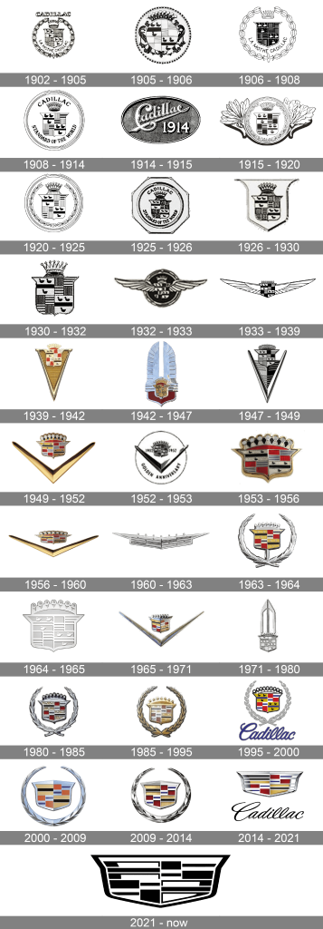
The brand’s logo is highly recognizable among people; that is based on the logo’s design made in 1906. During this period, the brand logo was redesigned 30 times. Today we will dig out the history of Cadillac’s logo from the beginning.
Meaning And History
1902 – 1905
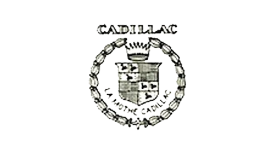
The first ever Cadillac logo was designed by the company in 1902. It came up with parallel lines and a crest with swans on it. A crown was placed on top and an ornate circle was used for framing. The making of the crest was the inspiration by Detroit’s cat of arms. After that, the word mark was placed in the middle of the logo and it gets registered in 1906.
1905 – 1906
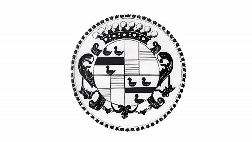
In 1906, the company redesigned the logo and converted it into circular shapes. It looked like a lighter version of checkers and ducks enclosed in the black crest. On the sides, the design team added some floral ornaments. This complete composition was then placed on a big white-coloured circle.
1906 – 1908
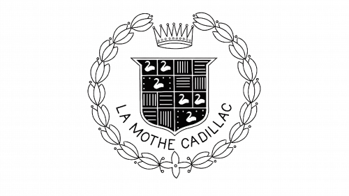
In these years, the company moved back to real logo design by refining all the contours of already presented elements. They cleaned up the background of the logo. For making small elements look visible, the crest was enlarged. The typeface was also changed with modern colour contours.
1908 – 1914
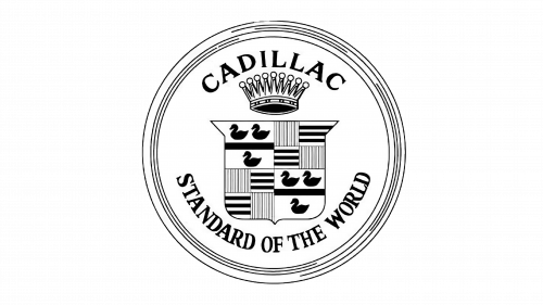
In 1908, the logo of Cadillac was made bolder and graphically strong than before. The logo proceeded with clean lines and an upper emblem along with the crown. The famous tagline was also added these years to the bottom “Standard of the World”.
1914 – 1915
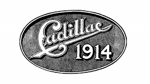
In the next year, the logo was completely changed. The company replaced the Cadillac letters with a big crown image and added the arched lettering inside the badge. It looked like two-winged elements with elongated different-shaped leaves.
1915 1920
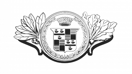
Again, the company decided to bring back the badge-styled logo in town. They kept it surrounded by an iconic crest engraved with a serif typeface. The bold black lettering was used with slightly enlarged letters for writing.
1920 – 1925
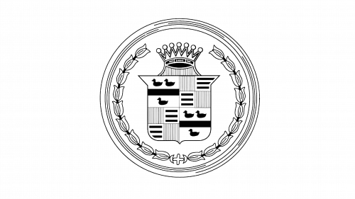
In the 1920s logo design, the lettering was again removed. The designing team decided to add a tulip ring ornate and changed the crown a lit bit. The logo remained untouched but with these changes, it started looking refined.
1925 – 1926
In 1925, the company decided to bring the badge logo back into town which only stayed for a year. The main wordmark was placed on top and the tagline was at the bottom.
1926 – 1930
In these years, the circular designed logo was lifted and they placed the crest with sharp corners and elongated lines. It stayed for 4 years and looked very powerful than before.
1933 – 1939

The again sharp and modern badge look was introduced with darker shades of drawing. It was further stylized with Li gated wings. The wings were created with thin black lines and equipped with seven little elements.
1939 – 1949

In these years, the most interesting looks of the logo were launched. The new geometrical version of Cadillac was made. A narrow triangle was set on the upper part of the logo which pointed down. it contained a monochromatic pattern on it which looked more traditional.
1949 – 1953
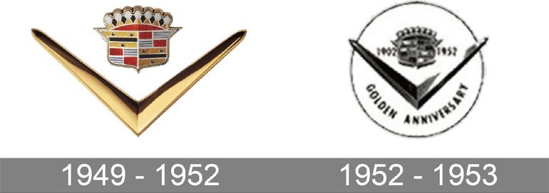
The red, gold, white and black coloured schemed logo was introduced which contained the combo of sharp bold tick enlarged horizontally.
1953 – 1956
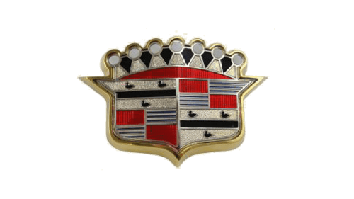
Its new design was shown to the world in 1953. It had the golden crest placed on white background without any additional elements. That looked powerful.
1956 – 1965
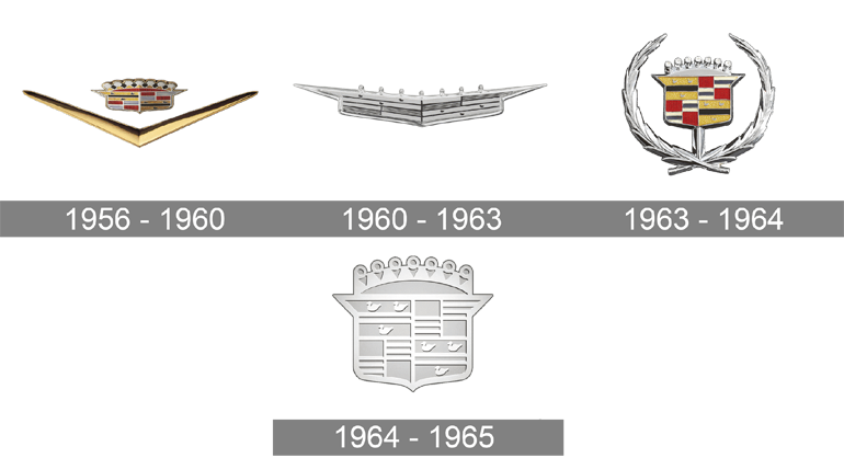
In these years, the V-type-looking logo was modified. They made it wider for making it look luxurious. The shield frame was made sleeker.
1965 – 1971
In these years, the tick-styled logos were back in town. It looked sharper and thinner with gold and silver bars. It was added with white and red.
1971 – 1985
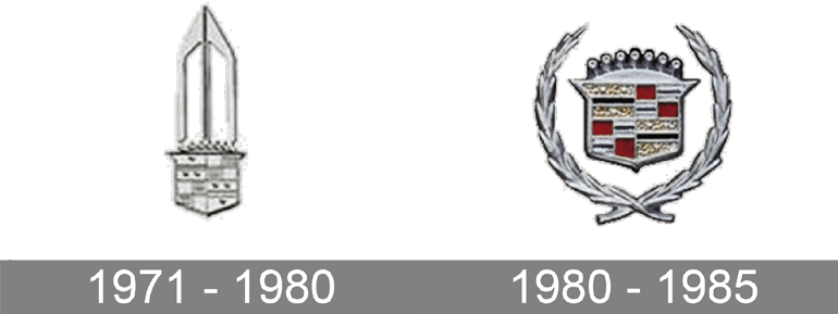
Under the extended geometrical element, the Cadillac crest was placed with the porting of the top border in a triangular shape. This logo was used by the company for ten years.
1985 – 2000
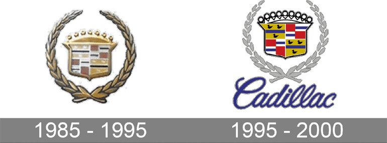
In these years, a golden-color pallet theme was introduced. All the silver shades were replaced with warm and shiny elements. It made it look more delicate than before.
2000 – 2014
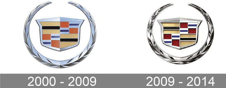
In these years, the logo was changed by using traditional colour tones which made it look more refined. This logo looked sophisticated which brings top-notch’s confidence to the brand.
2014 – 2021
In 2014, the company decided to remove the word mark from the logo and brought it to the bottom. The crest-styled is made more elegant with sophisticated lines. It was the perfect blend of crest shape and word mark shape.
2021 Today

In 2021, the logo was redesigned and changed the theme from white to black. This made the logos look very minimalist and powerful at the same time. This logo shows the symbol of perfection and excellence in the field of automobiles.
Bottom line
The logo of Cadillac has been one of the strongest and instantly recognized logos in car history. The brand wasn’t afraid of using various colour schemes or using 2D or 3D geometrical patterns. The logo still celebrates the legacy of the brand and its rich history.

