Aston Martin is a premium vehicle that combines luxury, speed, refinement, and quality. The company’s history began in 1913, when Lionel Martin, a car racing enthusiast, decided to build his car. Along with Robert Bamford, he founded the Bamford and Martin Company, then manufactured and sold cars.
The first Aston Martin racing car appeared in 1915. The name comes from the founder of Aston Hill and the founder of Lionel Race.
Meaning And History
The history of the Aston Martin brand is not accessible. The company has experienced many crises. For over 100 years, it has changed some owners. In 2012 Aston Martin became independent. The lineup of people in control of the company influenced the logo. But, despite frequent changes, there have been no fundamental changes.
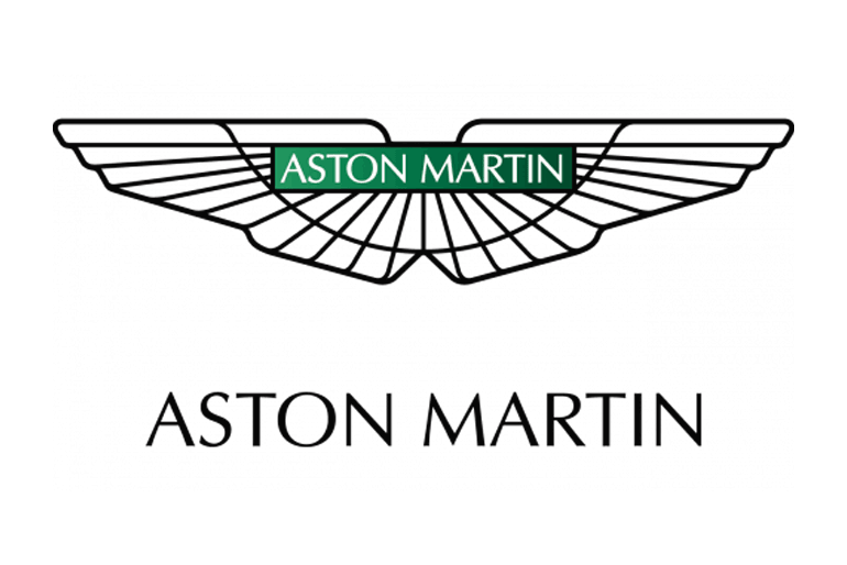
All Aston Martin logos, except the first one, have wings, making the emblem one of the most famous in the world. Fender symbolizes the main features of all the brand’s cars: freedom, speed, and dreams.
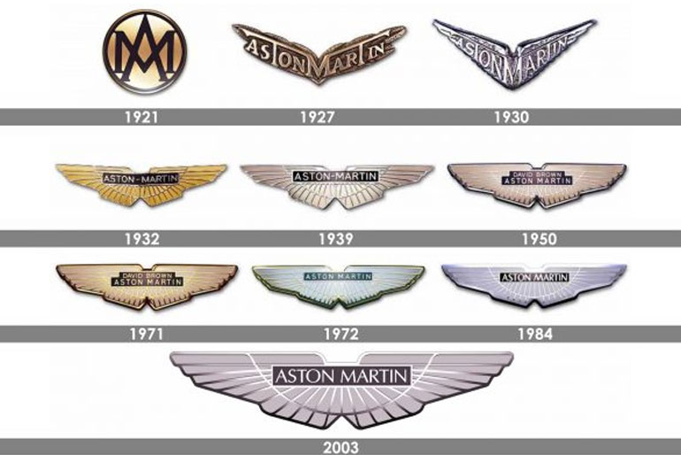
1921
The first Aston Martin logo appeared in 1921. It was elegant and concise. It is a circle with the letters A and M superimposed. The rigorous fonts, black letters, circles, and bronze backgrounds make the logo stylish and expensive.
1927
In 1927, the Aston Martin logo was changed for the first time. These were the most dramatic changes in history. The wings that symbolize speed have replaced the circle. The letters have been replaced with the full name of the company.
The inscription is arranged so that the letter M in the center connects with the horizontal elements of the two letters T. All that remains from the previous logo is bronze color, strict font, and brevity.
1930
In 1930, it was decided to change the bronze color of the logo to silver. Also, the wings have become sharper, and the contours have become more precise. The new Aston Martin logo has become more solid, but it lasted only two years.
1932
In 1932, the Aston Martin logo looks the same as it is today. The wings have gained “features” and are smoother. The company name was engraved in a rectangle and placed in the center.
Silver has been replaced by gold and black. The new logo looked more luxurious and was better than the previous one. This logo lasts for the next seven years.
1939
The 40’s logo differs from the 30’s logo only in color, with gold replaced by silver. These small changes make the logo more rigorous.
1950
In 1950, David Brown’s name appeared above Aston Martin’s lettering and was slightly smaller. The background color is now light brown with thin silvery lines. As a result, we can achieve a sense of lightness and a sense of freedom.
1971
The logo has been updated again. Silver was replaced by gold again. This option is probably the most luxurious, but it does not last long. The reason for this is a change in leadership.
1972
In 1972, Aston Martin was acquired by Company Development Limited. It led to the disappearance of David Brown’s name from the logo. The old primary color has been replaced with the new one that is cold gray. The lines remain golden but lighter.
1984
The logo was updated in 1984. According to the experts, it was not the best, and it lasted for about 20 years. The extended inscription, dashed lines and narrow letters make the logo more brutal and less sophisticated.
2003
In 2003, the new Aston Martin headquarters was opened. And in the same year, a relevant logo appeared today. It’s more elegant and modern. Currently, the word Aston Martin is in a green rectangle. The line is more refined.
The emblem embodies the main features of Aston Martin cars: prestige, professionalism, freedom, speed, and superiority. Simple fonts, minimalism, and cool silver colors show that the Aston Martin brand is reliable and expensive. The car is always good.
2021
The updated emblem comprises the same elements as the previous logo because the redesign affected individual details rather than the overall style. Now the ribs appeared on the spread wings, separating the adjacent wings from each other. The thin lines are voluminous and convex. But the broad stripes between them are hollow and visually placed below the level. This visual effect is created by casting a shadow below the top edge of the raised rib.
Below the junction of the wings is a small triangular notch that resembles the short tail of a divergent bird. This stylistic trick further connects the car brand emblem with high-speed flight at high speed. In the center of the oblong rectangle is the name of the car company. Also, the characters stand out slightly from the surface because it is made of a rib type with a 3D effect.
Conclusion
The Aston Martin logo has undergone various changes over the years. Still, it is one of the most iconic and widely recognized car logos ever created. The wing design was first adopted in 1927, with the company’s name placed on a pair of white wings.
Since then, it has been optimized and simplified in keeping with the contemporary design aesthetic. A wing is a traditional symbol of freedom, speed, dreams, and boundaries.


